Text hierarchy is the quiet, but very important part of any presentation. If you’ve ever made a presentation, added in all the images and animations but something felt ‘off’, it was most likely the text hierarchy. Text hierarchy helps organize thoughts and provide clarity, so the viewer knows where to start, where the important information is, and how to find the parts that are relevant and important to them.
Text hierarchy can be broken down into three main levels. Starting off is the Slide Title or Headlines. This introduces the topic that will be talked about on the slide. After that, there are sub headers or section titles. These are used to provide a general description of the content to follow as it pertains to the Title. And lastly, there is the body text, which is more descriptive text used to get into more complex ideas.
Besides these three levels, there are levers for these levels—ways to make each hierarchal moment distinct and easy to follow: typeface, weight, size, color, contrast, alignment, and position. All these properties of the text can be used to create hierarchy. Let’s take a look at an example of a presentation slide with no hierarchy vs. when hierarchy is applied.
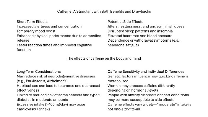
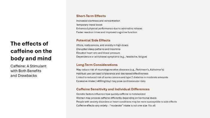
So, starting off, we have a title which is in the middle. This isn’t incorrect thinking but there are a lot of competing texts that make it hard to find what this slide is about. So, we’ve moved the title and subtitle to the side, increased the size of both so that they are distinct from the sub header and body text content, and bolded the title to intensify that separating from the other text on the slide. It also sets the tone for the slide—bolded text is the main point, which will then be followed by more descriptive text. The sub headers in the first image were correctly placed before the accompanying body text, but because there was no separation between the two, it read as one body text block. Adding in bolded font along with color creates that separation that these are not the title, but they are important. Lastly there is the body text that has largely been left alone other than some paragraph spacing to increase readability.
When it comes to visual hierarchy, consistency and restraint is key. Relying on too many fonts, colors, bolding all the text—these things flatten your message and we end up back at square one. But when done well, it creates a guide for the viewer to follow. They are able to scan the slide and can quickly figure out what information is important to them. This in turn leads to more engaging and exciting presentations.
Another helpful tip to keep in mind is less is more, especially when it comes to presentations. Having too much text makes presenting a presentation boring and interactive. Your audience will be spending all their time trying to read rather than focusing on what you have to say. A version of this with paired down text would look like this.
When creating your next presentation, start by creating a hierarchy for how you want the information presented—and stick to it.
Learn more about methods to keep your audience engaged!