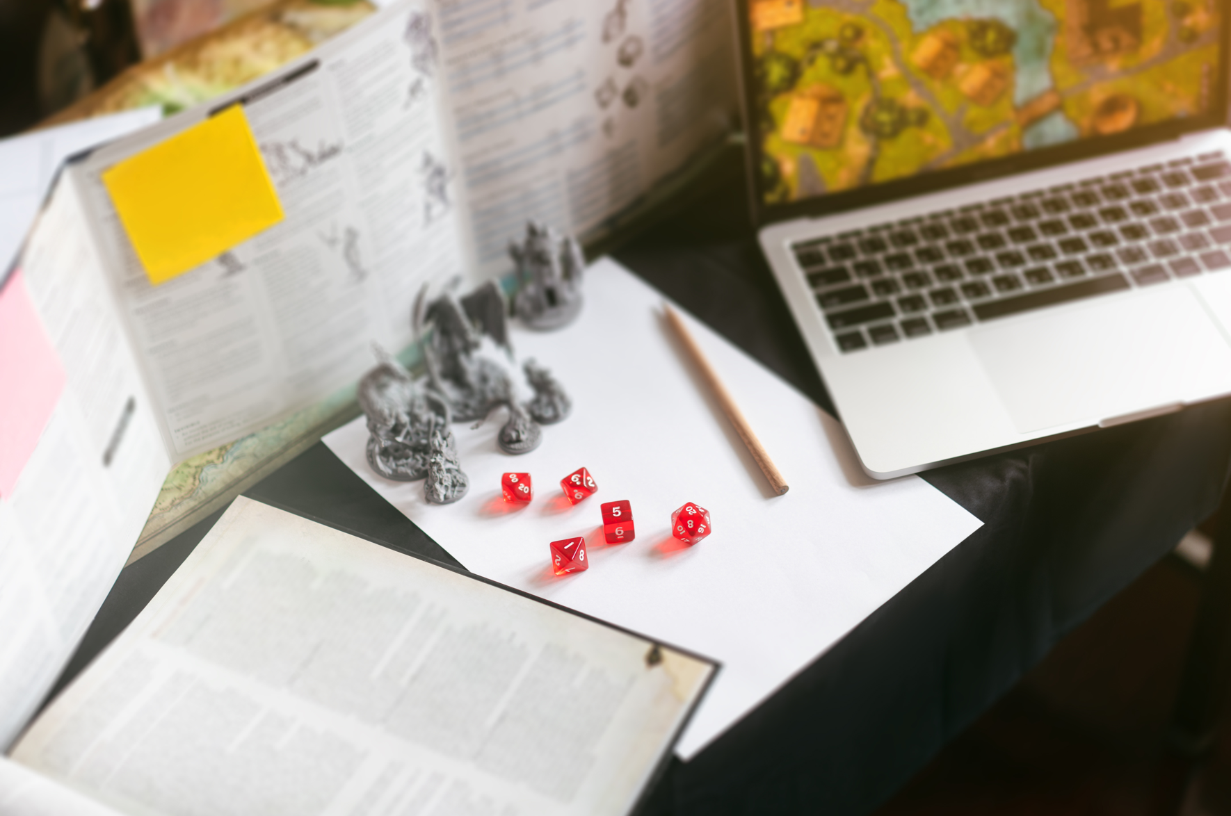
I grew up rolling funny-shaped dice in worlds with names like “The Shattered Expanse of Doom (Bring Snacks).” Dungeons & Dragons, Star Wars, Pathfinder—if it had a rulebook thicker than a phone book and at least three maps of the castle, I was in. For the uninitiated, a tabletop roleplaying game (TTRPG) is collaborative storytelling with rules: you describe what your hero does, the Game Master describes how the universe laughs, and the dice decide whether you become a legend or a cautionary tale.
I poured over those books. I marveled at the art, the charts, the graphs, the maps, the text—so much text—and the inexplicable table that only referenced another table two pages later. It was a feast of information design. TTRPGs are basically design school in disguise, if your professors also make you fight gelatinous cubes.
Consider the treasure trove of inspiration:
Now, port that straight into presentation design. Story first: every deck needs a quest, a hero, a conflict, and a resolution (ideally not involving fireballs, but let’s not limit ourselves). Slides are scenes; sections are acts; the takeaway is the epilogue. Communication through design? That’s your character sheet discipline: one idea per slide, clear labels, visual hierarchy that whispers, “start here.” The grid keeps layouts clean. Color and contrast guide attention. Icons become your initiative order. Speaker notes? That’s your Dungeon Master script.
TTRPGs taught me to turn chaos into clarity—and to make it look good on a 16:9 canvas. So if you need a deck that slays, hire the designer who’s already survived hundreds of dungeons. We know how to keep the party alive—and the audience rolling natural 20s for engagement.