In part I of this post, I provided some tips on creating effective charts and graphs. In this part, I will give you some tips on creating the data story.
Data visualization presents data visually and neutrally. The audience gets to choose what information to focus on. Data storytelling is a combination of visual information with context and narrative. The audience should focus on the argument or thesis that you present.
To keep your audience engaged, figure out the point you want to make and only include the information that is relevant to that point.
Keep each graph focused on a single takeaway. If you need to communicate multiple insights, use multiple charts instead of one complex visual.
When you present your argument with a series of individual graphs, make sure to keep them as consistent as possible. Use the same colors, the same fonts, and try to keep them the same size. Align the chart titles and chart legends the same way.
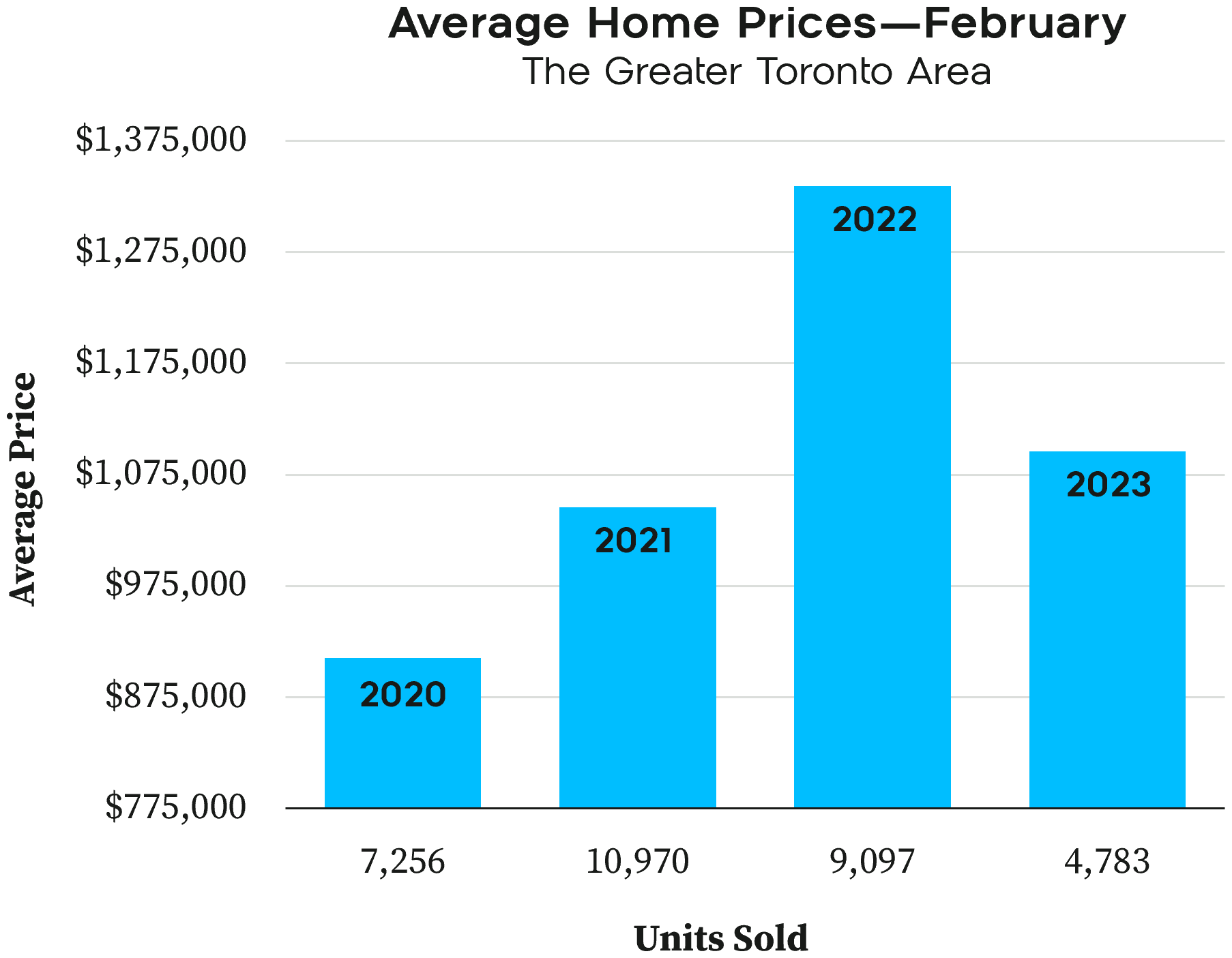
Let’s take a look at an example. We'll walk through each step of the process to evaluate the following chart based on data published by the Toronto Regional Real Estate Board.
This is a confusing chart, especially because it is trying to show too much with a single column chart. For February of each year, it is trying to show both the number of homes sold and the average price. But it’s not doing a good job. The data labels on the columns are unexpectedly the year, which has nothing to do with the height of the column. The Y-axis has numbers, but they aren’t in order and there is no visual comparison with them. But there is a potential data story that could be told.
Let’s convert this chart to something more understandable. This really needs to have two different data series; number of units sold and average price of each home. We could do this with two charts:

Now, at least, it is easier to figure out what the information means. But let’s try to make a story out of this. If I were presenting this, I would start by showing just the first chart (number of home sales.) I moved the data labels down, though, because I am going to need the space.
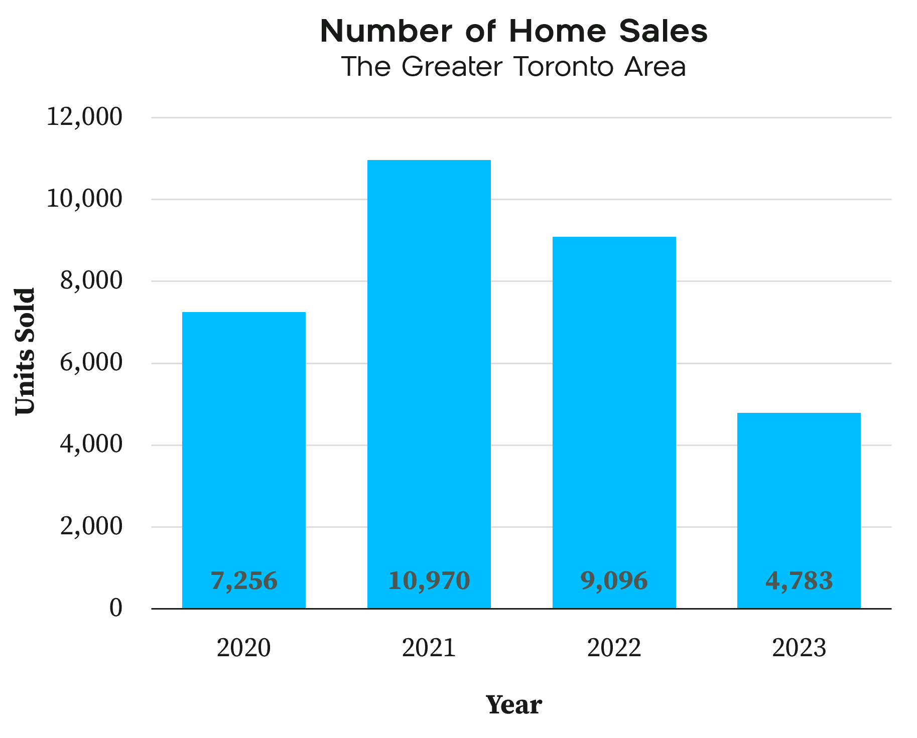
While showing the first graph, I would make a point to explain what the data is showing so there is no guesswork for the audience. The key point I would highlight here is the spike in home sales in 2021. Then, using animation or by using another slide, I would add the average price as a separate line chart:

I would draw attention to the fact that the line showing average home price is very similar to the number of homes sold but offset by one year. That might mean that the average home price is affected by the number of homes sold in the previous year. That could be some insight that I could add to the chart.
To keep your audience engaged, worry more about making your message clear than making the data fancy. Simple slides that make an argument will hold people’s attention while complicated slides will confuse them.
Full Fact Team, John Hastings via Jotform, Ivan Kilin via Datylon.
Recommended reading: Presentation Zen: Simple Ideas on PresentationDesign and Delivery, Third Edition by Garr Reynolds.