Raw data without a story carries no weight. In my career as a technical writer for companies like Microsoft and Boeing, along with my twenty years at Silver Fox Productions, I've found that proper data storytelling comes down to 4 core steps.
While these tips are derived directly from my day-to-day work in presentation design, the core principles apply to any document type.
Today we will discuss data storytelling specifically through effective charts and graphs.
When presenting complex data, you should start by considering the following:
In many instances, you will be gathering data from several different sources. Frequently, that information will come in different formats. It is tempting to combine all your information into a single chart, but that might not be the best idea. Each chart should only contain the data that supports the point you want to make.
It is easy to fall prey to the idea of including too much information for “background information” or “in case they want to see it.” If you want to include additional information, you can put it in an appendix, in hidden slides, or in a handout.
This also includes chart elements. Do you need to have both data labels and a Y-axis if they both contain the same elements? Do gridlines help people read your graph? Or do they just add visual noise?
Try to use the minimum number of colors. Use a bright color for the data series or data point that you want to highlight and use more muted colors for the others. Also, remember that not everyone sees color the same way. Using colorblind-friendly colors and clear labels helps make sure everyone can understand the data.
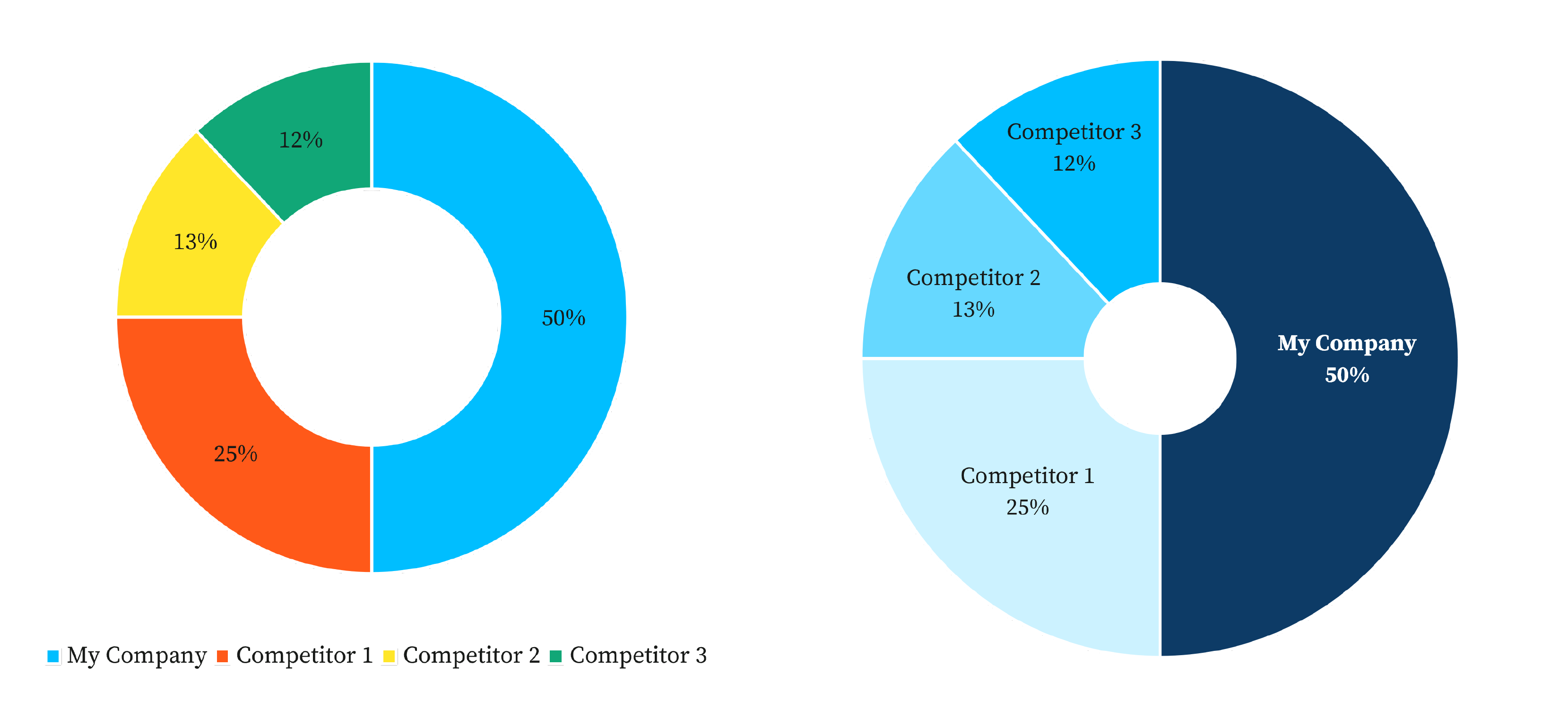
It is very tempting to try to jazz up your data by coming up with some cool new type of chart. These can work well for simple data presented to general audiences. However, in a professional setting, it is more important for a chart to be understandable than for it to be unique.
Here are some chart types that can detract from your data story:
3D charts of any kind. In most cases, the 3D effect does not make it easier to read the information.

Pie charts that have too many segments. If you have more than about four data points, use a different type of graph.
Column or bar charts where the Y-axis doesn’t start at 0. Column charts work best for comparing totals. If your Y-axis doesn’t include 0, you will mislead your audience by emphasizing differences. If you don’t want your chart to start at 0, consider using a line chart instead. Line charts are better for emphasizing differences instead of totals.
Column and bar charts are best for comparing totals. If the descriptions are long (survey answers, for example), use a bar chart. If the descriptions are short (dates, for example), use a column chart.
Line charts are best for continuous data, server usage for example. They are also useful if you want to show relatively small differences between data series, because you can adjust the starting and end points of the value (Y) axis without making the audience feel like you are tricking them.
Pie charts are best for showing a few (four or fewer) data points that add up to 100%. If you are showing more than four data points, use a different type of graph.
Waterfall charts are great for showing how additions and/or subtractions affect a total. In many cases, a waterfall chart is a story in and of itself!
Telling stories with data is a very big topic. In part I, I discussed some tips you can use to create more effective charts and graphs. In part II, I will continue by showing how to use a series of related charts and graphs to drive your point home. I will also look at some real-life examples. Thank you for reading!