You’re away from home, fueled by convention center coffee and pastries. You’ve spent the last couple of hours walking an expo hall, hearing pitches from booths covered in graphics and screens. Music is blaring, lights are flashing, and you’ve already sat through two or three breakout sessions, and it’s not even noon. You sit down for an executive keynote, and the slide on screen looks like an eye test you’d get at an ophthalmologist’s office. Percentages, dollar signs, and acronyms fill the screen. You try to follow the speaker while decoding the slide, but your eyes begin to glaze over.
Storytelling is what turns this sensory overload into an easy-to-follow narrative that keeps your audience engaged.
The real challenge is not simply fitting information onto a slide. It is deciding what the audience should understand first, what should come next, and what should stay hidden until it matters. A static slide asks the audience to process everything at once. Even with a strong talk track, viewers can scan ahead, focus on the wrong detail, or miss the relationship between ideas.
Purposeful animation gives the presenter control over that sequence. It introduces information in bite-sized pieces, guides attention, and helps the audience follow the same path through the story. A complex flowchart can be revealed step by step. A line chart can build over time, allowing the audience to experience the growth rather than simply seeing the final result.
To see how this works in practice, let's look at a simple example from a fictional logistics company.
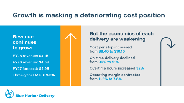
The slide below shows that revenue at Blue Harbor Delivery is increasing year after year, but that growth is masking challenges with operating costs. The issue is not that any individual element is poorly designed. The problem is that the conclusion, supporting data, and counterargument are revealed all at once. The audience has no clear starting point and no opportunity to experience the tension between growth and rising costs. That approach might work for a PDF intended to be read and referenced later, but it is too dense for an executive presentation. We can do better.
By separating the ideas and using animation with intention, we can turn the same information into a clear narrative.
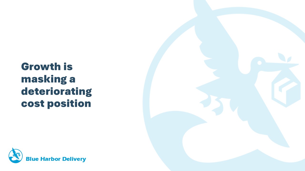
We begin with the conclusion rather than the data. Giving the central message its own moment tells the audience what matters and creates a question that the following slides must answer: If revenue is growing, why is the company’s cost position deteriorating?
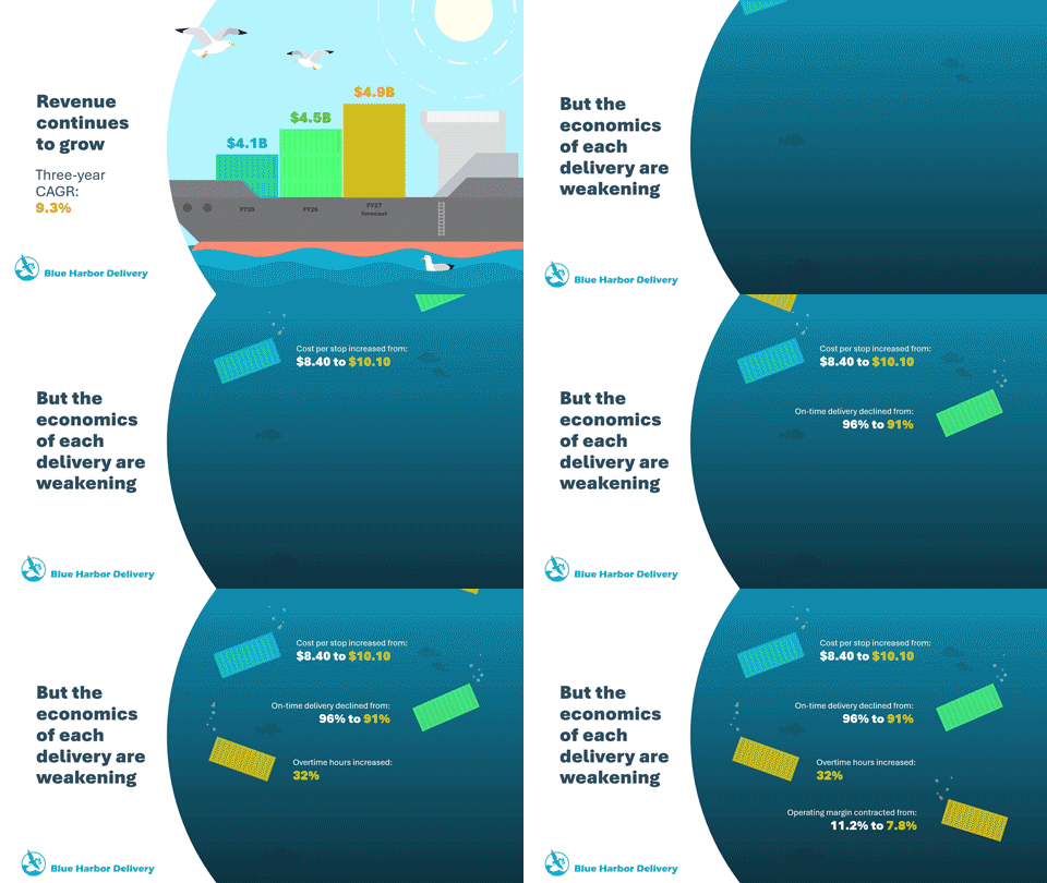
Next, we showcase the year-over-year revenue growth. Each year’s revenue is represented by a stack of containers on top of ship, with the waves beneath suggesting that the company’s revenue growth is keeping it above water. Good animation should behave like the idea it represents. Growth rises. A process moves forward. A comparison separates. A risk interrupts. When motion reflects meaning, the audience can understand the message before the presenter finishes explaining it.

Then the story turns. As the economics of each delivery weaken, the water rises and overtakes the scene. Some of the containers that previously represented building blocks of growth, tumble overboard and sink below the wave, suggesting lost profits, each one paired with a data point driving the point home.
Before adding motion, ask:
By sequencing the information and connecting motion to meaning, we transformed one crowded slide into a story with a clear beginning, turn, and conclusion. The audience first sees growth, then feels the tension, and finally understands the operational risk behind it.
That is what purposeful animation can do. It does not simply make a presentation move. It helps move the audience toward the idea that matters most.