Commonly, creative types know the basic visual strategies and guidelines when it comes to great design. However, working in the presentation space. Most of those strategies must be tweaked to ensure amazing design for all types of screens.
Most importantly, a designer must think about the type of screen on which the presentation will be showing. Screen type is usually easily identifiable when in close communication with the event producer, speaker manager, and speaker. For this blog, we will be discussing visual strategies for a basic large screen presentation. Let’s say somewhere between a small breakout and a massive keynote. We will be covering off on templates, colors, fonts, animation, and accessibility.
The screens for these types of presentations usually are 16×9 or similar. Most canned templates are created in this format. However, canned templates are not always best for creating compelling visuals that follow guidelines.
Templates
Customized templates ensure that a brand is being followed, and the guidelines are set for the other four topics we are covering. Templates allow speakers and designers to follow prescribed colors, fonts, animations, and accessibility standards.
Colors
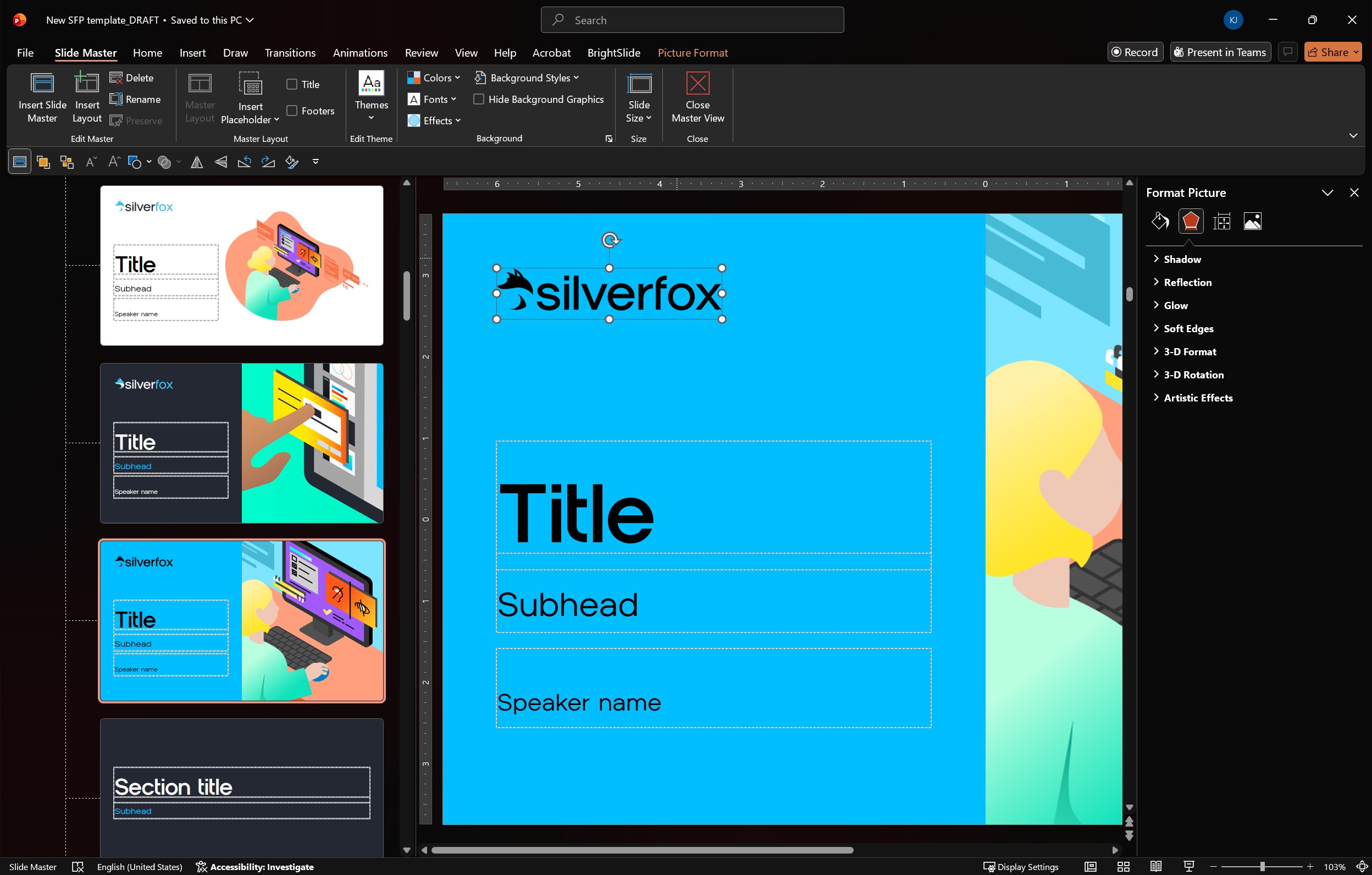
Creating a set of colors to utilize in your presentation will ensure the cohesion of visuals. One must also make sure to create a set of colors that is visually appealing and easily identifiable and differentiated. Choose a set of colors that give enough differentiation that visuals do not become muddy. Do not create a circus of a color set. Presentations usually allow six accent colors to be baked into a template. We usually utilize accents 1-3 as the primary colors to use. So, we will pick a mid-blue and light or dark blue for the first two. We will generally stay in that realm of colors for the remainder of the accents. By choosing greens or teals and possibly a couple of grays to round out the set, this will ensure that appeal, cohesion, and just enough differentiation.
Most importantly, we must ensure that the colors we choose are visible to the visually impaired. Make sure your color sets work on light and/or dark backgrounds. Make sure that the text contrast used on each color is high enough for all people. Make sure the colors are accessible.
Fonts
This is an essential piece for any presentation. Keeping titles at larger font sizes and body copy atsmaller font sizes creates a hierarchy in the content of slides. Some may choose to use bullets, and some may not. When not using bullets, size hierarchy is important. It is also imperative not to use multiple fonts in a design. Stick with the prescribed font in a template and go with it.
Another thing to keep in mind is that if everything is bold or italicized, nothing is. Even when keeping these font practices in mind, it is always best to use little text on slides. This ensures the attention of your audience is on the speaker and not the slide. Font size and coloring go a long way in following accessibility guidelines. To guarantee your message is reaching people of all abilities.
Animation
Movement is a huge part of any presentation. This can help with several things. Emphasizing your message, supporting the journey one is taking their audience on, etc. However, movement should be used with purpose and with elegance. For example, fast animations will not translate well on a 50 ft. screen in a mid-sized room. Be thoughtful of things such as these. Visuals and movement, when created thoughtfully, can support a message and uplift a message. But when abused, it can distract from the purpose.
Accessibility
When it comes to design, content must be accessible to everyone. Presentation tools are becoming more and more intelligent and inclusive from the accessibility checker in Office 365 to live subtitling and screen readers in PowerPoint. Honor your entire audience by utilizing the best practices laid out in this blog. Your message will go farther and reach more people.
For more information about how Silver Fox designs in this space, please explore our Services and our Work. In our next blog, we are going to be discussing how to bend these practices to better suit a digital event or presentation. Some design practices need to shift to meet this specific arena.